“Infographics are dead!” they shout. Far from it. Over the past 4 years, infographics usage has increased a staggering 65% among B2B marketers (Hubspot). They’re hardly dead — you just have to know how to use them effectively.
The Power of the Picture
Wield your infographics wisely, and you shall be rewarded.
- Consumers gobble up visuals: Eye-tracking studies show that internet readers spend more time looking at your pie charts and images than reading your text.
- Infographics impact website performance: Studies have shown they can increase website traffic by up to 12%.
So what’s the trick? Trick question! There is no trick. Like with any quality content, it’s about providing value. Create relevant infographics that resonate with audiences. Here are 5 examples of hospitals doing this well.
Mayo Clinic: Make the Complex Understandable
Analogies help with the hospital marketer’s task of turning complex info into something relatable. Infographics are a great place to use them. Mayo Clinic compares the anatomy of a heart to the blueprint of a house — something many people can understand.
This infographic also includes examples of heart specialists who work on the various areas of the “house.”
See the health infographic: Treat your Heart as a House
Cleveland Clinic: Use Visuals to Take a Stand
It takes guts for a hospital to stand loud and proud on a sensitive issue. Two years ago, Cleveland Clinic chose a side in the controversial vaccination debate. They used a variety of methods — including an infographic — to share their stance.
The infographic uses clean, uncomplicated visuals to display hard facts and tell a powerful story about the importance of vaccines.
See the health infographic: Why Cleveland Clinic Supports Vaccination
Einstein Healthcare Network: Making History Fun
“The history of our hospital begins in …” Cue the snoring — you’ve put your audience to sleep.
But Einstein Healthcare Network manages to make history exciting with a clever infographic.
The infographic subtly takes promotional, potentially boring content and makes it compelling. You actually want to find out what happens next! The timeline format and interactive animation keep you hooked till the end.
People can retain information better when it’s presented through images. So give your readers a visual to remember you by.
See the health infographic: From Its Humble Beginnings, How Einstein Grew
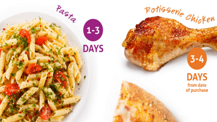
OhioHealth: Get in and Get Out (But Offer an Option for More Info)
A visual presentation doesn’t mean dumping all of your text into cute boxes and circles. Some people forget this, creating infographics that are way too long. (Will the scrolling ever end?)
People want information visually, but they also want it fast. This food safety infographic cuts to the chase. Visuals are large, and text is minimal.
But OhioHealth hasn’t forgotten that people often want to know more. For readers interested in the ins and outs of leftovers, they can read the accompanying blog post under the infographic. At Aha Media, we recommend this as a best practice: give readers quick facts or visuals as well as longer form content. Write a great blog post and then turn it into an infographic.
This approach makes everyone happy: the quick scanners as well as the deep divers.
See the health infographic: Leftover Lessons: Know What’s Safe to Eat and What’s Not
Northwest Primary Care: Go for the Niche
Another food pyramid infographic? Or stats about the flu? Meh. Why not spice it up a bit?
Go for a (relatively) untouched topic. Northwest Primary Care’s unique graphic focuses on “healthcare and the sandwich generation.” The graphic is designed using, you guessed it, a colorful sandwich theme.
This visual gives you a full understanding of the demographic that’s caring for both children and aging parents, including their pain points and healthcare solutions.
Use the power of an infographic to present facts on a niche topic, showcasing your organization’s expertise.
See the health infographic: Healthcare and the Sandwich Generation
Keep reading for more content marketing inspiration:
- 6 Visual Content Marketing Tips
- How to Pick the Right Content Type
- Patients or Doctors: What Content Do They Like?
Need help creating compelling content? Leave it to us.