Blog
Ready to learn? Explore our award-winning healthcare marketing blog and publications.
Can we help you find what you need?
Content Findability Tips: How to Get More Eyes on Your Content
Hide-and-seek is one of those games you don’t really want to win. No one wants to be the last one […]
Healthcare Content Audits: 10 Frequently Asked Questions
We get it. “Audit” is a dirty word to marketers. It feels a lot like cleaning out the attic — […]
Case Study: Can AI Write Website Content in Plain Language?
AI has come a long way since ChatGPT’s launch in 2022. When you want original content, AI still can’t replace […]
Website Redesign Coming Up? Start With a Solid RFP
A hospital website redesign is a substantial project. It’s the kind of long-term initiative many people dread — unless you’re content-obsessed […]
How to Add Healthcare Video Marketing to Your Strategy
Video marketing is everywhere. It’s on social feeds, it’s appearing higher on SERPs … sometimes, it’s even on a screen […]
Show, Don’t Tell: 5 Ways Medical Animations Can Complement Your Content Strategy
The year is 1995. You’re sitting in a dark theater when a desk lamp hops onto the screen, and the […]
Top Hospital Commercials of 2023 [10+ Hospital Ad Examples]
Every December, our team makes a master list of the year’s best hospital commercials. We feature ads that made us […]
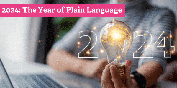
10 Data-Driven Principles of Plain Language
You know what plain language writing is. You know why using plain language matters in healthcare content, where words can […]
A Round of Applause for the 2023 eHealthcare Award Winners
Congratulations to all the winners of this year’s eHealthcare Leadership Awards! It’s amazing to see such creative work in healthcare […]
Human-Written vs. AI-Generated Healthcare Content: Which Is More Helpful to Patients?
Before we begin, let’s make one thing clear — we’ve always stood behind human-first, human-written content at Aha Media Group. […]
Marketing to Doctors? Here’s Why You Should Drop the Technical Language
Clear language is essential to healthcare marketing. It makes health information easier to understand and is widely preferred by caregivers […]
President of the Katalin Karikó – Drew Weissman Fan Club
An Aha Media Group writer remains starstruck after interviewing and writing about the 2023 Nobel Prize laureates in physiology or […]
What You Need to Know About Today’s Patient Experience [WEBINAR]
Join us for a conversation where personal experiences meet professional expertise. Hosted by the Forum for Healthcare Strategists on October […]
Hospital Website Redesigns: How to Prepare for a Major Update
Redesigns for health system websites are complex and time-intensive. It isn’t easy to take apart, reorganize and rebuild your entire […]


![Top Hospital Commercials of 2023 [10+ Hospital Ad Examples]](https://ahamediagroup.com/wp-content/uploads/2023/12/2023-Hospital-Commercials-Update-Annually.png)


![What You Need to Know About Today’s Patient Experience [WEBINAR]](https://ahamediagroup.com/wp-content/uploads/2023/10/Patient-Experience-Webinar-Featured-Image.png)

